Introduction
Alongside being a full-time student for the past few years, I have been working full-time as a meat cutter within a grocery store. It’s not exactly a passion of mine but it has been a great job with flexible hours while I complete my degree in Computer Science. So when given the task of picking a data set for my first data mining project, I thought some analysis of the industry I’ve been working in would be interesting.
The goal of this first project is to get some experience in the first steps of the data mining process. That being defining a problem and then understanding the data. There will be no data modeling at this point.
That being said, the main “problem” I will be tackling is to understand the meat industry and to predict the general trend of it. I plan on answering questions such as
- What is the general trend of meat consumption?
- What countries consume the most meat?
- Do some countries prefer different types of meat?
- Are there any peak years in meat consumption?
Beyond discovering insights within the data, I hope to develop my skills in the following libraries
- Pandas
- MatPlotLib
- NumPy
INTRODUCING THE DATA
The data set that I have chosen to explore is a single CSV from Kaggle.com, published by Vagif Aliyev and is licensed under Open Data Commons for public. You can view the meat consumption dataset here.
The meat consumption data contains the following features:
- Location – Country Code
- Subject – Type of meat (Beef, Pork, Poultry, Sheep)
- Time – Year (1990-2026)
- Measure – The measure used to show the value (KG per capita or Thousands of Tonnes)
- Value – Value according to the measure
PRE-PROCESSING THE DATA
My goal for pre-processing is to make sure all the data is consistent, accurate, uniform, and complete. However, before I dive into actually processing the data I need to do a little inspection to give some direction in my processing. Using the Pandas and NumPy libraries I was able to pull various information about the data. Some of the key characteristics I noticed are
- The data contains two types of measures
- Kilograms per capita and Thousands of tonnes. Both of these measures will be useful in different ways
- The data already contains prediction values for years after 2018
- Some of the location values are groups of countries
With these characteristics considered I could start formatting the data. I started by dropping the prediction values altogether since I am not interested in these. Next I dropped all the location values that are not individual countries. After that, I separated the data into two main dataframes, one for each measure.
Now that the data has been pre-processed to my needs, we begin understanding our data
DATA UNDERSTANDING
I will be using seaborn and MatPlotLib libraries to assist me in data visualizations
I will be creating various data visualizations to help us answers some of our initial questions.
What is the general trend of the meat industry?
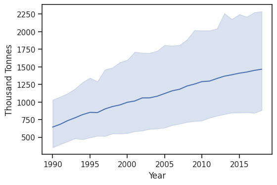
From this plot, we can clearly tell that the meat industry has been consistently growing for the past 30 years.
What countries consume the most meat?
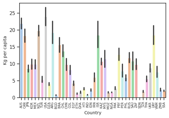
This plot gives a great overview of the the amount of meat each country is consuming. I decided to plot the KG per capita measure since it will give us a better picture of the proportion of consumption. This was we can compare big and small countries better.
What countries consume the most of each type of meat?
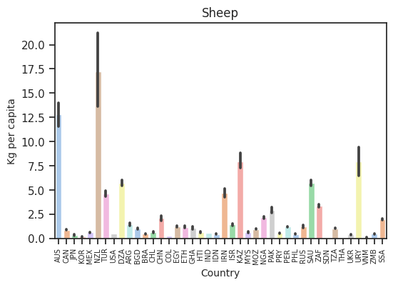


One thing that is clear is that some countries have a preference for certain types of meat. For example, New Zealand and Australia are the top consumers of sheep per capita but not for other types of meat. Uruguay and Argentina both consume very large amounts of beef per capita but not so much for other types. The USA consumes lots of each type of meat per capita except for sheep where it is near the bottom. It is interesting to see all the different preferences.
What is the percent growth in consumption each year?

Earlier, we saw that meat consumption was clearly increasing year by year, however when we look at by how much this consumption is increasing we gain a new insight. It is very apparent that the amount by which consumption is increasing is declining. Judging by the trend of the graph we can see that meat consumption may start decreasing soon.
RECAP
After visualizing a lot of the data, I really have a good sense about the overall trend of the meat industry. I was able to answer the questions that I wanted and more. I definitely struggled the most when it came to figuring out how to format the data in the way I wanted it to be. I knew what I wanted to do but I did not know how to do it. I’ve certainly learned a ton about Pandas, Seaborn, and the Data Mining process in general. I am eager to continue to learn data mining techniques and continue to grow when it comes to my technical skill.
All of the code implemented for this project can be seen within this Juypter Notebook on my GitHub
